

.svg)

The Top Tools to Measure Office Space Utilization
Most organizations already have some version of space utilization data. Badge swipes show building entries. Calendar systems log room bookings. Wi-Fi logs count connected devices.
The problem is that none of these sources were designed to measure how space is used. This leads to significant gaps between what they capture and what facilities teams need to make decisions.
Office space utilization analytics is the practice of collecting, combining, and interpreting data to understand which spaces are used, when, by how many people, and for how long. Getting it right requires two things: knowing which metrics inform the decisions you're trying to make and choosing measurement tools that reliably capture those metrics.
This article breaks down both sides of that equation. First, the core metrics that matter for enterprise space decisions. Then, a tool-by-tool comparison showing what each measurement approach can and can't tell you.
The Metrics That Matter for Space Utilization
Across enterprise space decisions, the same handful of metrics keeps surfacing. A real estate lead preparing for a lease renewal will weigh them differently than an operations manager rebuilding a cleaning schedule, but the underlying data is the same.
Utilization Rate
Utilization rate is the percentage of available space in use at a given time during operating hours. It shows whether a company is paying unnecessary costs for total capacity it doesn't use.
Say a floor designed for 200 people averages 60 occupants. That works out to 30% utilization, a number that should prompt a real estate team to question whether they still need the floor.
Peak vs. Average Occupancy
Average occupancy tells you what a normal day looks like, while peak occupancy tells you what the busiest day looks like. Together, they show the range a space has to absorb.
Build for the peak, and you'll pay for empty desks four days a week. Build for the average, and people will be hunting for seats every Tuesday and Wednesday. Hybrid work models have widened the distance between the two numbers, and the flexibility employees expect now makes peak days harder to predict.
Dwell Time
Dwell time measures how long people stay in a space once they're in it. It tells you which rooms people pass through and which they actually use, and it's especially relevant for areas designed with a specific purpose in mind.
Say a focus room averages a seven-minute dwell time. People are probably ducking in for quick calls, not settling in for heads-down work. A collaboration zone where dwell times cluster at 90 minutes or more is a better sign the space is being used as intended.
Traffic Flow and Movement Patterns
Flow data shows how people move between zones across the day. It surfaces high-traffic areas like coffee stations and reception, dead corridors no one uses, and work areas stranded too far from the teams that book them most. None of those patterns show up in a single occupancy reading.
Flow data is also the foundation for adjacency planning. The goal is to position related spaces close enough that people use them together.
Time-of-Day and Day-of-Week Trends
Occupancy rarely holds steady across a day. A building might fill up between 9 and 11 a.m., empty out at lunch, refill in the afternoon, and clear out before 5 p.m. Hybrid policies have made the weekly utilization trends even more pronounced, with midweek peaks and lighter Mondays and Fridays.
Facilities teams use trend data and real-time data to schedule cleaning, utilities, and security staffing against real demand.
A cleaning manager can route crews to the floors that were used, and a building engineer can program HVAC to throttle energy consumption down on light days without sacrificing comfort. Those kinds of adjustments add up to meaningful cost savings, but without trend data, the decisions run on assumptions.
Space-Type Comparison
Space-type comparison looks across categories of space rather than at any one room. Conference rooms, open desks, phone booths, lounges, and focus zones all compete for square footage and capital, but the different types of spaces don't all earn it equally.
For example, a facilities team might find that their large meeting rooms run at 20% utilization while their phone booths are booked solid. Space-type comparison tells a portfolio team to shift space allocation toward the team's needs in practice, turning occupancy data into a budget conversation. When you can show finance that meeting rooms sit at 20% while phone booths stay full, the request to convert one large room into four booths stops being a hunch and becomes a line item.
How Different Tools Measure Space Utilization (and Top Brands to Consider for Each)
A Butlr survey of 400 U.S. buildings and facilities decision makers found that no single measurement method dominates. Desk and room reservation systems lead at 55%, followed by employee surveys (54%), sensor-based occupancy tracking (53%), badge and card-swipe data (51%), Wi-Fi and network log-ins (46%), and manual headcounts (39%).
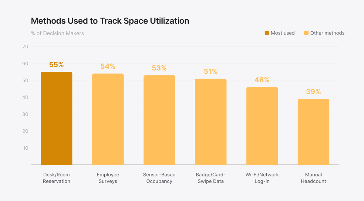
The numbers show a market where every facilities management team is patching together an office space monitoring stack from the resources they already have. Each source delivers part of the picture, and the gaps between them are where decisions go wrong. The sections below map what each method delivers against the key metrics above, so teams can identify the right tools for the data they need.
Badge and Access Control Data
Badge systems log building entries and exits. In buildings with per-floor turnstiles or card readers, they can also log floor-level access.
Once someone walks through the door, the data stops. Say 200 people entered the building on Tuesday. The swipes show the entries, but not whether those people sat at desks, used conference rooms, or spent the day in the cafe.
Tailgating goes uncounted, since multiple people often enter on a single swipe, and early departures stay invisible unless the building requires badge-out.
As a building-level baseline, badge data works well. It's often the first source facilities teams reach for because it's already running, but it can't support room-level decisions on its own.
Top badge and access control tools to consider:
- Honeywell: Enterprise-grade, integrates with broader building management systems
- HID Global: Widely deployed across corporate campuses, supports mobile credentials
- Brivo: Cloud-based with a strong API for combining access data with other platforms
Wi-Fi and Network Analytics
Wi-Fi analytics count connected devices in a given zone based on which access points they associate with. Some platforms estimate zone-level density by triangulating signal strength across multiple access points.
Accuracy depends heavily on the network. Say a single access point covers two conference rooms and the hallway between them. The system can't tell those three spaces apart, and anyone carrying a laptop and a phone gets double-counted. Guests on the public Wi-Fi or off the network entirely don't show up at all.
Wi-Fi works best for floor-level or zone-level occupancy rates in environments where the network is already dense enough to provide reasonable coverage. It's a low-effort source of directional data, though it isn't reliable for room-level decisions or dwell time.
Top Wi-Fi and network analytics tools to consider:
- InnerSpace: Indoor location intelligence layered on existing Wi-Fi infrastructure
- Basking.io: Plug-and-play Wi-Fi occupancy analytics for enterprise real estate teams
- Cisco Spaces: Built-in analytics for organizations already on Cisco infrastructure
Calendar and Booking Systems
Calendar and booking platforms capture room reservations and let employees book desks in advance. They show intent, or what people planned to do with the space.
The problem is that intent doesn't always equal behavior. Ghost bookings, where someone reserves a room and never uses it, are one of the most common complaints facilities teams report. Booking data alone can't surface them.
Booking platforms also miss ad hoc usage, like the team that grabs an open conference room without reserving it or the employees who sit at unassigned desks without checking in.
This kind of data is most actionable when teams pair it with occupancy data. Comparing bookings against real-world use surfaces the gap between policy and practice, including hoarded rooms and bookings that never materialized.
Top calendar and booking tools to consider:
- Robin: Workspace analytics with strong support for large enterprises with multiple locations
- Envoy: Workplace management with visitor and desk booking in one platform
- Skedda: Flexible booking rules engine, popular with mid-market organizations and universities
Employee Surveys
Surveys ask employees directly about how often they come in, which spaces they use, what they think is missing, and how the workplace feels day to day. No space utilization sensor or system can capture insights into the employee experience like a direct response can.
People are poor estimators of their own behavior. An employee who believes they come in three days a week often averages closer to two when badge data tells the story. Low response rates make the gap worse, since a small number of employees often don't represent everyone else.
Surveys work best alongside behavioral data, not in place of it. A workplace sensor can show that a collaboration zone goes unused, while a survey can explain that the acoustics make it hard to think.
Top employee survey tools to consider:
- Leesman: Built specifically for workplace experience measurement with strong industry benchmarking
- Qualtrics XM: Enterprise-grade experience management with advanced analytics
- Culture Amp: Combines engagement surveys with action planning tools
Manual Audits and Walkthroughs
A walkthrough puts facilities staff on the floor with a clipboard, counting occupants at set times across the day.
Everything between observation points goes uncaptured. A 10 a.m. and 2 p.m. count misses the lunchtime drop and the 4 p.m. exit, and observer bias creeps in once the same person has walked the same floor a few dozen times. Across a portfolio, the math stops working, since no facilities team can keep enough auditors in the field.
Walkthroughs are most useful as a sanity check. Teams run them during a sensor rollout to validate the data, or to set a quick baseline before investing in any measurement technology.
Sensor-Based Occupancy
The technology inside the sensor determines what it measures, where it can go, and how quickly it scales across a portfolio. The three most common types for space utilization are passive infrared (PIR), camera-based, and thermal.
PIR (Passive Infrared) Sensors
A passive infrared (PIR) sensor fires when it detects a change in infrared radiation, which usually means someone has entered or left its field of view.
PIR doesn't count people. Motion is the only signal, so a room with one person sitting still for 30 minutes can register as empty, and a room with eight people looks identical to a room with one. The number of people in the room and how long they stay both fall outside what the technology can deliver.
For binary occupied-or-not signals on individual desks or small rooms, PIR works well. The sensors are inexpensive and easy to install across large floor plates, which makes them practical for basic presence detection.
Top PIR sensor tools to consider:
- Disruptive Technologies: Compact wireless desk occupancy and motion sensors with up to 9-year battery life, 98% detection accuracy, peel-and-stick install
- Signify (Philips): PIR occupancy detection built into commercial lighting systems
- Lutron: Occupancy and vacancy sensors integrated into lighting control systems
Camera-Based Occupancy Sensors
Cameras paired with computer vision can produce a full slate of metrics. Headcount, dwell time, traffic flow, and spatial positioning all become available, and higher-end systems can tell people apart from objects and track movement paths across a space.
Privacy review, works council approval, and employee pushback can slow or block deployment, particularly in regions covered by strict data protection laws like the General Data Protection Regulation (GDPR). Cameras also can't go into restrooms, prayer rooms, or healthcare facilities, which limits portfolio coverage.
Camera-based sensors work best in environments that need visual-level granularity and have already cleared the privacy review. Installation typically requires power and network connectivity, which adds cost and lead time on top of any compliance work.
Top camera-based occupancy sensor tools to consider:
- VergeSense: AI-powered optical sensors with detailed workplace analytics and benchmarking
- PointGrab: Camera-based sensing with computer vision for headcount and spatial analytics
Thermal Occupancy Sensors
Thermal sensors read body heat to detect presence, count people, and track dwell time and traffic flow. Because the signal is thermal rather than visual, the data is anonymous by design, with no image, silhouette, or way to identify an individual from the readings.
Thermal sensors can tell a facilities team how many people are in a room and for how long, but not who. For utilization analytics, anonymity is the goal, not a limitation. Teams that need to tie occupancy to individuals, like hot-desking by name, can pair thermal sensing with a booking or badge system.

Enterprise-wide deployments benefit from thermal sensors when accuracy, privacy, and installation speed are all priorities. They work in sensitive spaces like restrooms, prayer rooms, and healthcare facilities, where cameras can't go. Battery-powered models install without electricians, which lets teams cover full portfolios in weeks rather than months.
Top thermal occupancy sensor tool to consider:
- Butlr: Enterprise-grade thermal sensing platform with API-first architecture, SOC 2 Type II certified, deployed across global portfolios
Butlr's thermal sensors cover the full range of utilization metrics without introducing privacy risk. If your team is evaluating measurement tools for a portfolio-wide deployment, request a demo to see the platform in action.
Matching Tools to Metrics: A Side-by-Side Comparison
The table below pulls together the breakdown from the sections above. It maps each measurement method against the six core utilization metrics, so facilities teams can see which tools deliver which data.
On metrics alone, camera and thermal sensors look identical. The difference shows up in deployment, not measurement. For organizations that need the full set of office space utilization metrics without the privacy and deployment overhead, thermal sensing delivers both.
Stronger ROI comes from matching the measurement approach to the metrics your team actually needs. Butlr's thermal platform is built for portfolios that need that match without the privacy and deployment trade-offs of cameras.
Ready to see what accurate, privacy-safe utilization data looks like across a full portfolio? Learn more about Butlr here.
%20(1).png)

.png)
.png)
.webp)
