


.svg)


Occupancy Analytics: What Space Data Actually Tells You
Most facilities teams are making portfolio decisions based on badge swipes, calendar bookings, or gut instinct. However, none of those sources reflect the reality of how space is being used. Badge data tells you who entered a building, but it misses where they sat or how long they stayed. Calendar bookings show intent while ignoring behavior. And manual walkthroughs capture a snapshot instead of a trend.
Occupancy analytics solves these gaps by collecting continuous, sensor-driven data on how people move through and use physical spaces. When done well, it gives commercial real estate (CRE) and facilities teams the evidence they need to right-size a lease, reallocate underused rooms, or justify (or defer) a capital project.
What Is Occupancy Analytics?
Occupancy analytics is the practice of using sensor data to measure space usage over time. An occupancy analytics solution goes beyond simple headcounts and captures occupancy trends like which rooms are consistently underused, when peak demand occurs, how long people stay in a given area, and how movement patterns shift between zones.
It's easy to confuse occupancy analytics with a few adjacent concepts:
The data collection methods shape what the occupancy analytics can do. Passive infrared (PIR) motion sensors are inexpensive but can still miss stationary occupants, and camera-based systems are accurate but often face resistance during procurement review.
Thermal sensors detect body heat without capturing images, devices, or identities, which is why they tend to pass legal and compliance review faster in strict privacy environments.
The deployment footprint matters as much as the space utilization sensing technology. If your sensor approach can't cover a bathroom, a clinical setting, or a European office, it limits which questions your analytics can answer. The constraint shows up most in flexible workplaces, where workstations, meeting rooms, and common areas all need coverage to produce a complete picture.
Key Metrics Occupancy Analytics Tracks
Each metric below answers a different question about how a space performs and points to a different kind of decision. Together, they translate raw occupancy rates into specific decisions about peak usage times, occupancy limits, and resource allocation across the portfolio.
Utilization rate gets the most attention, but it's the easiest space utilization metric to misread. A meeting room booked 80% of the time but occupied 30% of the time is technically utilized. But in practice, it's ghosting other teams who can't get on the calendar. Pair utilization with dwell time, and you can separate booked-but-empty meeting rooms from workspace that's actually working.
A 10-person conference room booked every morning from 9 to 11 but showing an average dwell time of 22 minutes tells you people are holding quick standups in a room sized for strategy sessions. That room could be split into two huddle spaces without anyone noticing.
Peak vs. average is the metric that tends to drive the most contentious conversations between workplace teams and finance. Designing capacity around the monthly all-hands means paying for square footage that goes unused most days. Designing around the average risks leaving teams without overflow when they need it. Most portfolios end up somewhere in between, and the data helps pinpoint exactly where.
How Occupancy Analytics Supports Real Business Decisions
The value of occupancy analytics comes from the decisions the data supports. Below are the most common ways CRE leaders, facility managers, and facilities teams put occupancy analytics to work.
Portfolio Right-Sizing and Lease Decisions
Many enterprise leases now coming up for renewal were signed before hybrid work settled into its current pattern. The assumptions built into those agreements (headcount projections, days-in-office expectations, seat ratios) often reflect a workplace that no longer exists. Renewing on outdated assumptions can lock in costs that won't match how office spaces get used over the next decade.
Occupancy data lets teams enter renewal negotiations with evidence rather than estimates. For example, a floor running at 35% average utilization with peaks at 60% twice a quarter is a different conversation than one running at 80%.
What the team does with that information still depends on lease structure, sublease market conditions, and what the business expects from the space. But the data anchors the discussion in something measurable. These decisions often stall because finance, sustainability, and real estate teams are each working from different numbers. A shared occupancy dataset gives them one source to work from.
Deferring or Validating Capital Projects
One of the highest-value applications is using occupancy data to challenge expansion plans. Companies often budget for new construction or additional leases based on projected headcount, only to find that existing space is significantly underused once the data comes in.
The reverse case is just as valuable. When data confirms a space is genuinely at capacity, the business case for expansion gets stronger and easier to defend to a CFO. Expansion decisions still hinge on growth forecasts, capital availability, and market timing. But occupancy data adds a layer of evidence that has been missing from most planning conversations.
Demand-Based Operations
At most large enterprises, cleaning, HVAC, and staffing still run on fixed schedules. The same crew shows up on the same day to clean the same number of desks, whether 200 people used the floor or 20. The same HVAC zones run on the same setpoints regardless of whether anyone's there. If your seventh floor consistently shows fewer than 15 occupants on Fridays, you're cooling 20,000 square feet and sending a full cleaning crew for a space that could run on reduced HVAC setpoints and a single custodial pass.
Real-time occupancy data and historical trends feed into building management systems, cleaning platforms, and HVAC controls to shift these schedules from fixed to usage-based. Without that integration, the data stays in a dashboard. With it, you have a working operations tool.
The per-day savings on operational costs aren't dramatic, but at a portfolio scale, they add up across custodial spend, energy consumption, energy usage, and ESG reporting. The type of sensor affects how much you save. A Pacific Northwest National Laboratory simulation of large office buildings found that occupancy-based controls using basic presence sensors could cut lighting and HVAC energy use by about 5.9% nationally, compared with 17.8% for sensors that count occupants.
What Using Occupancy Analytics Looks Like in Practice
The data is most useful when you can see how it shows up in real decisions. The two examples below come from Butlr deployments.
Scaling Collaboration Across a Distributed R&D Campus
A semiconductor R&D campus with 15,000 employees and eight buildings was running into a familiar set of problems. Collaboration rooms in some buildings were impossible to book. Adjacent buildings had open space no one was using.
Employees were walking between buildings to find a free room, and the facilities team had no real-time visibility into availability across campus. The company was planning a $50 million expansion that included a new floor lease for 190 additional desks, plus lease renewals on two floors that combined lab and office space.
Butlr deployed 1,200+ occupancy sensors across lab-adjacent offices and conference rooms, with data piped into the company's internal business intelligence (BI) dashboards via API. Within weeks, the data showed:
- 28% of collaboration space was underutilized
- A large lab space with low utilization could be converted into desk space, eliminating the need to lease a new floor
- The campus could absorb more than 1,500 additional people in its existing footprint by repurposing underutilized lab areas
- Space allocation was rebalanced across the eight buildings
The $50 million planned expansion was deferred entirely. Beyond the savings, the data changed the planning question itself. The team stopped debating where to expand and confirmed they didn't need to expand at all.
Butlr helped this team deploy 1,200+ sensors and surface these insights within weeks, not months. If your team is facing a similar portfolio decision, learn how Butlr's occupancy analytics platform works.
Turning Underused Retail Space Into a Revenue Driver
A top-tier luxury retailer knew its fitting rooms were valuable floor space but had no way to quantify how those spaces contributed to revenue. Top clients preferred personalized, high-touch experiences, and sales associates were already spending meaningful time supporting VIP shoppers in fitting areas. The retailer wanted to convert traditional fitting rooms into personal shopping suites but needed data to justify the redesign.
Butlr deployed workplace sensors that produced anonymous data on occupancy and dwell time in fitting areas to confirm if all fitting rooms were being used, how frequently, and how usage compared to the rest of the floor.
After the conversion, the data told a clear story:
- 20x increase in ROI per square foot compared to the prior layout
- $10,000 to $40,000 higher spend per visit from top-tier customers using the new VIP suites
- Measurable gains in sales associate productivity tied directly to client time
- A concrete roadmap to connect fitting room usage data to revenue operations going forward
Occupancy data gave the team what it needed to justify the redesign on revenue grounds. It's also a useful reminder that occupancy analytics belongs in conversations beyond CRE.
When you can tie dwell time to spend per visit, the same data that sizes a portfolio can shape merchandising strategy.
Reading the Data: What Occupancy Dashboards Show
A common concern from teams evaluating occupancy analytics is whether the output will be usable or buried in a black box. The occupancy analytics dashboards below show what the readout looks like in practice, combining real-time data with historical trends across desks, meeting rooms, and common areas.
This view breaks down how different public space types perform relative to each other. The data shows employees gravitating toward environments designed for collaboration and heads-down work alongside traditional desk areas. The floor plan overlay distinguishes zones with sustained usage from those that serve as transitional, short-stay areas.
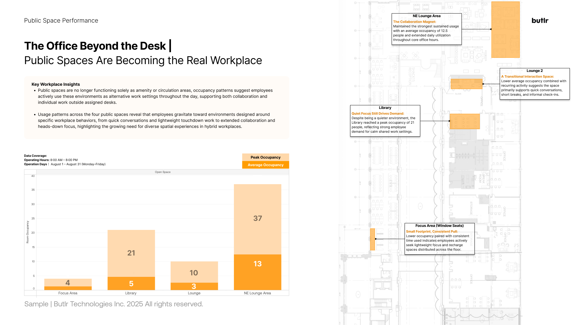
In practice, a workplace strategy lead uses this readout to defend or challenge a space program. A library zone showing strong sustained dwell next to an underused traditional desk neighborhood raises a useful question about which space types the workforce is choosing and whether the program reflects that.
This portfolio-level view shows workstations grouped by neighborhood, comparing utilization across zones and tracking shifts over time. Most neighborhoods are consistently busy during active hours but rarely hit full capacity, which suggests opportunity for load balancing and flexible seating policies rather than adding more workstations.
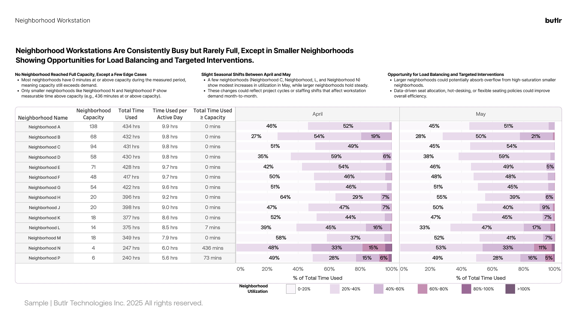
The month-over-month comparison is what makes this view useful in finance conversations. Trend lines, seasonality, and projections are the inputs finance teams expect when evaluating any line item, and workplace utilization data has historically lacked them.
When your CFO asks why the facilities budget should stay flat while headcount dropped 12%, a dashboard showing that Tuesday and Wednesday utilization actually increased 20% quarter-over-quarter gives you the data to explain where the money is going. Portfolio dashboards close part of that gap.
The organizations getting the most from occupancy analytics are the ones that start with a clear question and choose a sensing platform that gives them reliable, privacy-safe data at scale.
Most teams already suspect they're overpaying for space they don't fully use. The question is by how much, and what to do about it. Butlr's occupancy analytics platform can answer both. Request a demo to learn more about your portfolio's real utilization data.
.png)

%20(1).png)
.png)
.webp)