
How to Run an Actionable Office Space Utilization Analysis
Category
Category

DAte
June 25, 2026
Category
Share
.svg)
.svg)

Most commercial real estate (CRE) and facilities teams have some version of utilization data, whether from badge swipes, booking systems, or periodic walkthroughs. The problem is that those numbers rarely add up to a clear answer when leadership asks whether to renew a lease, consolidate a floor, or redesign a space mix.
Space utilization analysis closes that gap between having data and making an informed recommendation. A strong analysis structures raw occupancy information into a layered picture of how space is used, from portfolio-level benchmarks down to hourly room-level patterns. Each layer connects to a specific decision.
This guide walks through what a space utilization analysis should cover, the metrics each layer depends on, and what the outputs look like when applied to an enterprise portfolio.
Space utilization analysis is the process of collecting, organizing, and interpreting occupancy data. It informs how you design, allocate, and operate space.
It differs from raw occupancy counting. Occupancy tells you how many people are in a space, while utilization analysis tells you whether that space does what it's designed to do.
Hybrid work has made the distinction harder to ignore. Static planning breaks down when attendance varies by day. Say a floor runs at 85% capacity on a Tuesday and 20% on a Friday. Averaging those into one number hides both the Tuesday crowding and the Friday waste, which is exactly what utilization analysis untangles.
A handful of metrics do most of the work in measuring your workplace's utilization. Each one answers a different question.
You won't need all six for every analysis, but reading one in isolation will steer you wrong. A single floor-level average, for example, can mask day-of-week swings and space-type imbalances that call for different fixes.
The tools you use to measure office space utilization shape how you capture each metric. Badge swipes, wi-fi data, and occupancy sensors each pick up something different.
A single utilization percentage tells you almost nothing on its own. A useful analysis works in layers, each one feeding a different space optimization decision, from flagging underused spaces to relieving crowded ones.
The five layers below run from the widest view across the whole portfolio down to real-time behavior inside one room. The patterns in each layer come from anonymized utilization data across Butlr's customer portfolio, covering multiple regions and dozens of sites.
Portfolio-level analysis lines up occupancy rates alongside peak occupancy across regions, cities, or building clusters. It exposes which sites carry real estate costs without enough use to justify them and which run at or near total capacity. The benchmark is internal, a way to see whether one region runs leaner than the others and what's driving the difference.
Uneven utilization across regions points to portfolio imbalance rather than local inefficiency. For instance, one region might average 42% utilization with only 38% of its floors above 70% occupancy. Another might average 71% with 48% of floors past that mark.
The comparison drives a set of concrete calls:
None of this works without consistent data from every site. A team pulling badge data from one building and manual audits from another can't line the two up. Butlr solves that with multi-site deployment and portfolio dashboards.
Site-level space mix analysis maps meeting room saturation against workstation utilization, site by site. For each location it answers one basic question. Is the site short on desks and overloaded with meeting rooms, or the other way around?
Not every site needs the same ratio. A site with full meeting rooms and empty desks calls for one kind of intervention, and a site where both go unused calls for another. The mix usually falls into one of four patterns:
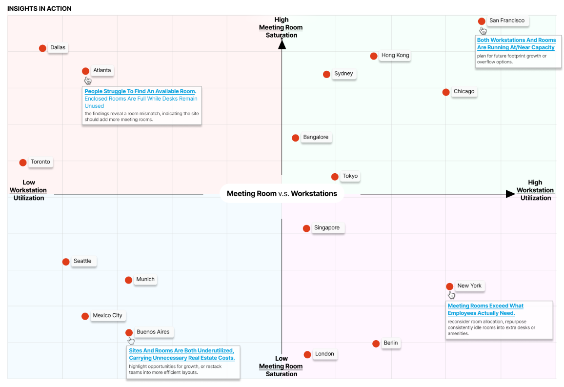
The pattern points to the fix. You reallocate space inside the site by converting rooms, adding focus pods or phone booths, and adjusting the desk-to-room ratio.
From there, rank which sites need a light restack and which need a full redesign by how severe the mismatch is.
Floor and team-level analysis breaks utilization down by floor, and by team or department where the data allows. It checks seat-level use against the stacking plan, the assignments that put each team on a given floor.
Stacking plans rarely match current reality. Teams might grow, shrink, or move to hybrid, but floor assignments can stay frozen for years. A hybrid office that leans on hot-desking and shared workspaces needs flexibility and adaptability the original plan never built in.
On one floor a team might run at 15% desk utilization while another two floors up hits 100% and turns people away. At the building level the totals look balanced, even though individual floors are badly misallocated. Floor-level data also catches phantom space, floors that read as occupied on the stacking plan but stay empty most of the week.
From there, you restack teams to consolidate underused floors and free up square footage, flag the floors you can close or sublease, and shape hybrid schedules around the teams whose attendance swings most.
But a framework only works on reliable data. If your inputs are inconsistent or patchy, the analysis built on them will be too.
Butlr's thermal sensors capture anonymous, seat-level occupancy across every space type, including rooms where cameras can't go, with no images and no personally identifiable information. Request a demo to see what that looks like across your floors.
Room-level analysis works at the finest scale, tracking hourly and day-of-week patterns inside individual rooms. It catches ghost bookings that are reserved but never used, oversized rooms holding one or two people, and the swing between peak and off-peak hours. It also maps room usage against cleaning schedules to find where service is wasted on empty rooms and where busy ones get skipped.
Fixed cleaning, HVAC, and lighting schedules run on the clock instead of on occupancy, and room-level data shows how much that wastes:
Cleaning can shift to follow the peaks and skip rooms no one used. HVAC can zone by occupancy, dropping to standby when a room is empty and ramping to full output at capacity.
Restrooms are one of the biggest examples. Most facilities clean them on a fixed rotation regardless of actual traffic, which makes them one of the largest cleaning cost sinks in a portfolio. Butlr's smart cleaning module tracks restroom traffic and triggers cleaning based on use rather than the clock. Across Butlr's customer base, that shift saves an average of $1,400 per restroom per year.
Booking policy can tighten too. Auto-release, for example, frees a booked room after a set window (say 15 minutes) if no one shows up, putting the time back in circulation. And right-sizing nudges can steer small groups out of oversized rooms, which might then become focus pods, phone booths, or flexible collaborative spaces.
Real-time traffic analysis counts the number of people who enter and leave a space as it happens. Pair that live feed with historical patterns and you can forecast peak usage times and steer people toward the calmer windows.
Shared spaces like cafeterias, lounges, and amenity floors can flip from calm to packed in minutes. Without a live signal, employees and visitors have no way to time their arrival. Crowding hurts the employee experience, and a heads-up prevents it.
Take a cafeteria that climbs from 25% occupancy to near capacity in under 15 minutes during the lunch rush. The peak lands between 12:00 and 1:30 p.m. almost every day. Anyone arriving at 11:30 or after 1:45 skips the crush, but only if they can see the pattern coming.
Live data turns that into adjustments you can make on the spot. Real-time alerts through Slack, Teams, or digital signage fire as a space nears capacity, and break schedules stagger around the historical traffic. During predicted peaks, facilities management teams can add staff or open overflow space, and employees get to choose for themselves when to use a high-demand space.
A sound framework still produces bad recommendations when you read the data behind it the wrong way. These mistakes are common culprits.
Average utilization flattens the signal. A building at 50% average could be perfectly balanced or badly lopsided, depending on which days and which floors drive the number. Stop at the building average and you'll miss floor-level mismatches, day-of-week swings, and space-type imbalances.
Badge data from one site, manual audits from another, and booking data from a third won't line up side by side without normalization. Feed inconsistent inputs into a portfolio benchmark and the comparison misleads. A lot of teams stall here, holding plenty of data that refuses to line up.
A room running at 80% capacity from 9 to 11 a.m. and empty the rest of the day amounts to a two-hour spike wrapped around six hours of waste. Label it an 80% room and you'll plan around demand the space rarely sees. Ignore the time dimension and you'll misread both the problem and the fix.
A single-week audit captures a snapshot, not a trend. Seasonal patterns, policy changes, and headcount growth all move utilization over months. Treat one week as the permanent answer and your data is stale before the lease talks even start.
Four things tell you whether your space usage data can carry an analysis this detailed:
Butlr's thermal sensors check every one of those boxes. They capture anonymous occupancy with no cameras, personally identifiable information, or device tracking. Because they install easily across even large portfolios, the analysis can start producing insights in weeks rather than after a multi-quarter rollout.
Want to see what a utilization analysis looks like for your portfolio? Request a demo of Butlr.

West Coast, US
800 Airport Blvd
Burlingame, CA 94010
East Coast, US
501 Mass Ave
Cambridge, MA 02139
Japan
CIC, 1 Chome-17-1 Toranomon,
Minato City, Tokyo 105-6415

.png)

.png)
.png)
.webp)