


.svg)


How Office Heat Maps Improve (or Mislead) Decisions
Facilities teams regularly make floor plan, lease, and resource allocation decisions without a reliable picture of office space usage. A conference room that looks busy on the booking calendar may be half-empty most afternoons. And a wing that seems underutilized may be packed during hours that an average-based report would never show.
Office heat maps overlay real occupancy data onto your floor plan in a color-coded format, showing where people gather, how densely, and when. For facilities directors and workplace strategists managing hybrid portfolios, they're one of the most practical tools for turning raw occupancy data into something you can act on.
But a heat map is only as useful as the data source powering it and your interpretation of what it shows. Let's learn how office heat maps work, which data sources produce the most accurate results, and the common mistakes that lead to bad space decisions.
What Is an Office Heat Map?
An office heat map is a color-coded visual overlay on a floor plan that shows occupancy intensity across zones, rooms, and desks. Warmer colors like red and orange indicate high usage or density, while cooler colors like blue and green indicate low usage.

The term heat map also describes website analytics tools that track where visitors click and scroll. Office heat maps work on the same visual principle but measure something entirely different. They represent physical presence and movement within a built space, not digital behavior.
An office heat map can display different views depending on the question you're asking. For example:
- A real-time view shows how densely each zone is occupied at the moment
- An aggregated view averages usage across a week or month to show which areas get the most use over time
- A traffic flow view traces how people move through a space, highlighting the corridors and pathways they travel most
The Data Sources That Power Office Heat Maps
A heat map is a visualization. The data behind it determines how accurate and useful it is. Two heat maps of the same floor can tell very different stories depending on whether the data comes from a booking calendar or a sensor network.
Six data sources commonly generate office heat maps. Here's how they compare.
Start with booking and reservation data. A reservation only proves someone planned to use a room. Ghost bookings inflate apparent demand, while unbooked walk-ins go uncounted. That means a booking-based heat map distorts in both directions at once.
Badge data runs into a similar wall. It confirms a person entered the building but little else. For example, a badge swipe at 9 a.m. can't tell you whether that person spent the day at a desk, in conference rooms, or in the cafe. Without room-level resolution, badge records can't produce a heat map with any spatial detail.
Wi-Fi and Bluetooth tracking gets you closer to room-level data. But it infers location from device signals, which creates two problems. Positioning accuracy varies by method but typically falls in the 3 to 15 meter range, which is enough to place someone on the wrong side of a wall. If your open workspace shares a wall with a conference room, a Wi-Fi-based system could count desk workers as conference room occupants, making the room look consistently overbooked when it's not. And because smartphones randomize their media access control (MAC) addresses, one person can register as several devices or none at all.
Cameras are accurate, but they create compliance risk. The hardware can capture identifiable images no matter how the software is configured, which draws scrutiny under GDPR, CCPA, and European works councils. Plus, cameras can't be deployed in restrooms, wellness rooms, or other privacy-sensitive areas, leaving blind spots in coverage.
Passive infrared (PIR) sensors are already installed in many commercial buildings as triggers for lighting and climate systems, but they only detect motion. One person in a conference room reads the same as eight, and someone sitting still at a desk can register as absent.
Thermal sensors round out the list. They detect body heat, which lets them count individual people and register occupants who aren't moving. Because they capture no images and no personal data, they can operate in the privacy-sensitive spaces where cameras can't.
Butlr's sensors use thermal detection to generate heat maps with 95%+ accuracy and zero personal data collection. Learn more about how Butlr helps you optimize your office spaces.
How Facilities Teams Use Office Heat Maps
So what do you do with all this data once you have it? Heat maps support decisions at every scale, from moving a bank of desks to exiting a lease.
Layout and Floor Plan Changes
Facilities teams have traditionally judged layouts through walkthroughs and employee feedback. Both sample a single moment, but neither holds much weight when a department pushes back on losing space. A heat map replaces those impressions with a continuous record of how every zone performs.
Say a heat map shows collaboration zones in the east wing running at high density every afternoon. Yet desks in the west wing barely register activity. This pattern would make the case for converting underused desk clusters into collaboration space. It would also confirm the change addresses a daily need rather than a one-off crunch.
Meeting Room Right-Sizing
Presence data alone can't right-size a meeting room. A room that registers as occupied all day would look healthy even if every meeting involved just two people around a 12-person table. You need headcount to see the mismatch.
Butlr's heat maps pair occupancy intensity with people counts, so a 12-seat room averaging three attendees would be easy to spot. A pattern like that would flag an opportunity to split the oversized room into huddle rooms that match how teams meet.
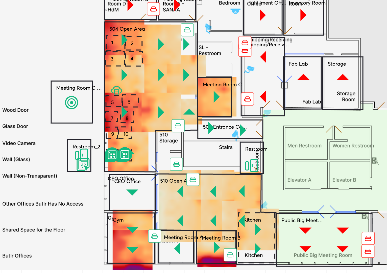
Heat maps also expose ghost bookings. A room that's fully reserved on the calendar but cold on the heat map would call for a policy fix, like auto-releasing rooms that stay empty 10 minutes past the start time.
Demand-Based HVAC and Cleaning
Heat maps can run parts of the building day to day, starting with climate control. Fixed HVAC schedules assume a full building. Hybrid work broke that assumption. In a Butlr survey of 400 US building and facilities decision makers, respondents estimated that an average of 24% of their office space is heated and cooled for nobody in a typical week.
Real-time heat map data can pull those schedules back in line with how the building gets used. Connected to a building management system (BMS) through an API, HVAC output can scale automatically to match the zones people occupy. This allows the building to respond without anyone reviewing a dashboard or filing a work order.
Cleaning can run the same way. Zones the heat map flags as high-traffic get serviced more often, while untouched areas can be skipped on light days. Custodial hours shift to match actual traffic.
Butlr's API-first platform connects heat map data to the building management, workplace management, and maintenance systems you already run. Request a demo to see how it works with your stack.
Lease and Portfolio Decisions
At the portfolio level, and heat maps inform the biggest calls a facilities team makes. Lease decisions involve the largest dollar amounts and the least room for error, so they demand the longest data window. Analyzing utilization across a quarter or more of heat map data can show whether an entire floor or building consistently underperforms. That's evidence strong enough to support consolidation or renegotiation.
The same data changes the negotiation itself. Walking into a lease conversation with a quarter of zone-level utilization history would put you in a stronger position than citing badge counts a landlord could dispute.
Across a portfolio, standardized heat maps make buildings comparable. When every location reports utilization the same way, you can rank buildings on a single scale and decide where to invest, densify, or exit.
Common Pitfalls When Using Heat Maps in Office Spaces
Heat maps often look self-explanatory, but they require a more careful read than you might think. There are four common mistakes that turn good data into bad decisions.
Relying on Averages Instead of Time-Based Views
An averaged heat map smooths away the very peaks and valleys you need to see. For example, a zone that averages 40% utilization might run at 90% on Tuesdays and 10% on Fridays. But the weekly view would paint it a uniform lukewarm orange.
Act on that average, and you could cut space your teams depend on every Tuesday or keep space that's empty four days out of five. Either mistake would be expensive. Worse, both would seem justified by the data.
The way around this is to segment the data rather than average it. Filter heat maps by day of week and time of day. For instance, comparing Tuesday middays against Friday middays would show the real demand curve rather than a flattened summary of it.
Using Booking Data as the Only Input
As covered in the data source comparison above, booking data only records intentions. No-shows and unbooked walk-ins can leave the schedule looking nothing like the floor.
Rather than throwing booking data out, lay sensor-based occupancy readings alongside it and compare the two for each room. A room booked 80% of the time but occupied only 45% of the time would point to ghost bookings, a no-show culture, or a room people avoid. Neither number alone could tell you that.
Collecting Too Little Data Before Acting
One week of heat map data describes that time period, not your workplace. A holiday, an all-hands, or a heavy travel stretch can skew seven days of readings badly enough to point you the wrong way.
Say you install sensors the same week your company runs its annual sales kickoff. Every floor looks packed, the cafeteria heat map glows red, and collaboration zones hit capacity. If you used that week to plan your space, you'd be building for the busiest week of the year instead of a more typical one.
Give the data time to settle. Four weeks of continuous collection begins to show reliable patterns, and a full quarter accounts for seasonal swings. Wait for the quarter before making any decision that would be expensive to reverse, such as a layout change or a lease commitment.
Establish a baseline before you act on anything. Once you know what normal utilization looks like, every later period has something to measure against. This way, real shifts separate cleanly from ordinary noise.
Not Connecting Insights to Building Systems
In a typical failure mode, the facilities team generates a heat map, presents it at a quarterly review, and then adjusts operations by hand. By the time those changes take effect, the patterns may have already moved on.
A heat map on a slide can only describe the building. Feed the same data into your building systems through an API and HVAC, cleaning, and room availability displays can adjust automatically based on actual occupancy.
What to Look for in a Heat Mapping Solution
Not every platform that produces a heat map deserves consideration on your shortlist. If you're evaluating options, these criteria separate the tools that make nice visuals from the ones that support real decisions:
- Privacy by design: The sensing hardware should be incapable of capturing personal data, not merely configured to avoid it. GDPR reviews and works council approvals hinge on the difference.
- People counting: A binary occupied-or-not reading can't power a useful heat map, so the system should count individuals and detect someone sitting still at a desk.
- Time-segmented views: You should be able to filter by day of week, time of day, and custom date ranges rather than settle for a single aggregate view.
- Scalability: A solution that works on one floor should extend to a full building or portfolio without a rip-and-replace.
- API and integration support: Heat map data that stays in a standalone dashboard has limited impact, so the platform should offer APIs and webhooks that feed your existing building and analytics systems.
- Fast deployment: Battery-powered wireless sensors that install in minutes, with no electrician or cabling, can cut time to first data from months to weeks.
Butlr's thermal sensing platform was designed around these requirements, from anonymous-by-design sensors to an API-first architecture that connects with the systems you already run. See how Butlr turns occupancy data into smarter space decisions.


%20(1).png)
.png)
.webp)


