

.svg)

Office Space Utilization Benchmarks: Key Numbers for 2026
Most workplace leaders can pull a utilization number, but very few can say with confidence whether that number is good. They might spot 52% desk utilization on a dashboard and have no idea if that means they're running an efficient floor or paying for half an office nobody uses.
That uncertainty is expensive. Benchmarks are supposed to settle it by helping you compare your numbers against what similar buildings achieve, find the gap, and act on it.
But the benchmarks floating around the internet are scattered and rarely sourced. And they're almost never tied to the one thing that decides whether they mean anything, which is how the data was measured in the first place. A 70% utilization figure from continuous sensor data and a 70% figure from a one-week manual audit aren't the same number, even though they look identical on a slide.
According to a Butlr survey of 400 US building and facilities decision makers, only 19% say their space planning decisions are based mostly on data, while more than a third run on gut instinct. Knowing the benchmarks is only useful if you can trust the numbers you are measuring against them.
This guide pulls the benchmarks that matter into one place, organized by space type, with the source behind each range. It also covers how to tell whether your own utilization data is trustworthy enough to benchmark against at all.
What Office Space Utilization Benchmarks Measure
A utilization benchmark is a reference range for how intensively a space gets used over a set period. It's calculated as the occupied share of total available space. The standard formula:
Utilization Rate (%) = Occupied Hours / Available Hours × 100
In office space discussions, these three related terms get used interchangeably, even though they measure different things:
- Occupancy is the number of people in a space at a given time
- Utilization captures the use of available space over a period
- Frequency, or attendance, is how often people come into the office in the first place
A space can show high occupancy and low utilization at the same time. For example, a meeting room booked for one hour and then unused for the next seven reaches 100% occupancy at its peak but only about 20% utilization across the day. A benchmark built on the peak reading would tell you to keep that room, while the daily figure suggests you could let it go.
That's why a benchmark is only comparable when it comes from the same window and method as your own data. For example, peak hour utilization and daily average utilization are based on distinct windows. Confusing them will lead you to an inaccurate insight.
Office Space Utilization Benchmarks by Space Type
Utilization runs at different levels depending on the space. A floor of assigned desks, a bank of huddle rooms, and a specialized lab can share one building and report figures with little in common. Each type needs its own benchmark.
Whole-Building and Portfolio
Across global office portfolios, CBRE puts current utilization near 53%, up from 35% in 2023 and 38% in 2024. JLL's parallel figure is 56%. Yet most organizations want more, with 79% targeting 65% or above.
A building-level average hides the data that matters. And a single portfolio number is the easiest benchmark to hit but the least useful one to act on.
Use the portfolio number to gauge yourself against the market. The decisions that save money come from a level down, where you can determine floors to consolidate or sublet.
Peak vs. Average
In CBRE's Americas survey, 73% report peak occupancy effectively at total capacity on their busiest days, between 61% and 100% occupied. But average occupancy looks very different, with 66% reporting utilization below 60% on a typical day.
A swing that large makes the average a poor guide for sizing a hybrid office. Size to the average and busy days turn into a scramble for desks, which pushes people back home. Build for the peak instead and most of the week you end up heating and cleaning a near-empty building.
Track peak and average separately and you can plan for the swing instead of guessing. You size fixed seating to the average and cover the busy days with shared, bookable space. That way the building works on Tuesday without paying for an empty Friday.
Space per Person
CBRE tracks two density figures that often get confused. Design density is about 190 square feet per seat, the square footage behind each built workspace. People density is closer to 158 square feet per person, the floor area behind each employee you support.
In CBRE's benchmark, people density runs lower than design density, which happens when an organization seats a larger workforce than it has desks. The bigger that difference, the harder each seat works, since the same number of employees shares fewer desks.
Read both as planning inputs, not scores. The right target depends on how often people come in and the mix of desks and rooms they need, so a denser floor isn't automatically a better-run one.
Desks and Workstations
In general, healthy desk utilization hovers between 60% and 70%. It makes sense once you account for slack.
Desks running at 100% mean someone always loses the hunt for a seat. That's why the 60–70% band leaves headroom for busy days and for the flexibility people want in where they work. When available desks consistently outnumber the people using them, the slack turns into waste.
Run under 50% week after week, and you can cut desks or move to sharing without complaints. But push past 80%, and people start hunting for seats, booking desks they won't use, and arriving early to claim space. The crowding usually calls for more bookable space, not just more desks.
Meeting Rooms
Meeting room targets usually depend on size. As a general rule, they're 50% to 70% for small rooms, 60% to 75% for mid-size, and 40% to 50% for large ones.
But room utilization hides how meeting rooms get used. For example, a 12-person room booked all day for two-person calls reads as fully utilized even though most of its seats stay empty. Tracking seat occupancy alongside meeting room utilization exposes the waste in oversized rooms.
The low benchmark for large rooms reflects how rarely meetings need that many seats. Special-purpose space shows the same oversupply, with JLL putting technical and specialized rooms at 45% use against a 72% target.
Collaboration and Common Areas
A utilization percentage is the wrong yardstick for collaboration and common areas. These zones are built to swing between full and empty across the day, so a low occupancy rate reads as failure when it isn't. The better benchmark is their space allocation, or the share of the floor plan they take up.
CBRE splits the floor plan into four shares, including individual workspace, collaboration space, support, and amenity. In its global benchmark, support has crept up to 24% of floor area, while an activity-based office design would use about 15%. Collaboration is at 19% and amenity at 22%, both at or below where that workplace design model would put them.
Support is back-of-house, the printer rooms, mail rooms, and IT closets, and it keeps expanding. The collaboration and amenity space people come in for stays capped below the activity-based target. Judge these areas on desk-style utilization and you'll cut the very physical space hybrid work depends on.
Why Most Utilization Benchmarks Can't Be Trusted
Almost every decision maker wants better visibility into workplace utilization data, but few have it. In Butlr's survey, 87% call understanding space usage beyond a headcount a high or top priority. Yet 62% can't spot unexpected uses of space without asking or watching employees, and only 19% base their planning on data-driven insights.
How the Measurement Method Changes the Benchmark
Unreliable metrics usually trace back to the tools behind them. Decision makers often handle the monitoring of office space usage with general-purpose tools rather than occupancy sensors made for the job. Each borrowed method distorts the data in its own direction.
For example, badge data shows the problem. Knowing that 70% of the week's badge-ins landed on one day tells you nothing about which floors were packed or which rooms went unused.
Here's a full breakdown of measurement methods:
The Barriers to Better Measurement
Even when teams know their method is flawed, replacing the existing tools they use to measure space utilization can feel like a hassle. Our survey found that 90% of decision makers worry about how long a new system takes to install and start producing usable data. More than half (55%) name finding a system that scales as a top barrier, while 48% point to integration with what they already run.
Privacy is the most common barrier of all. Nearly all (92%) say it stands between them and the data they need, and 63% call it a moderate-to-major obstacle. At organizations with more than 1,000 employees, that figure climbs to 69%.
Before you trust any benchmark, including your own, find out how the number was produced. A 55% built on ghost-inflated reservations isn't the same as a 55% built on continuous sensors. Only one is worth acting on. Fix the measurement before you worry about the benchmark.
What the Cost of Bad Benchmarks Looks Like
Acting on a number you can't trust has a price. Our survey shows that decision makers estimate they heat or cool 24% of unused or underused space in a typical week. This creates an unnecessary cost in every energy bill. Energy tops the list of expenses where better data would save money, named by 62%.
Cleaning also has a major blind spot. More than four in five (82%) say their cleaning schedules aren't built on occupancy data, and 66% clean every area at the same frequency no matter how much it's used. Crews service empty floors on the same rotation as full ones.
The bigger cost is the decisions that never got made. Uncertainty about space use has stalled major capital plans:
- 52% delayed or canceled expansion plans
- 48% delayed or canceled renovations
- 47% postponed or canceled energy-management investments
- 44% put consolidation plans on hold
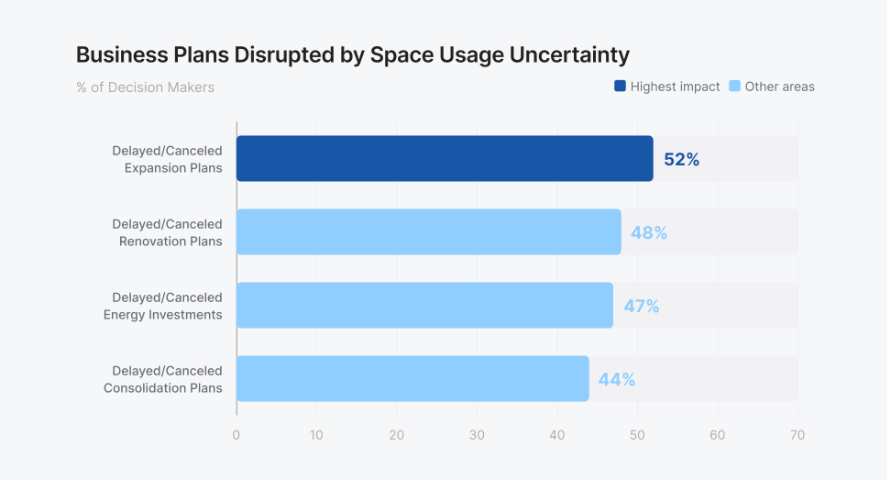
Every one of those plans stalled on data nobody trusted enough to act on. The result is paralysis that costs more than any single wrong number.
What Good Office Space Utilization Measurement Looks Like
Trustworthy measurement shares three traits:
- Continuous: A one-week audit or a quarterly survey catches a single moment and misses the rest. An always-on measure is the only way to capture accurate utilization.
- Space-level: A building-wide number can't tell you which floors were full or which rooms went unused. Measuring room by room connects a benchmark to the decision about that room.
- Anonymous: With 92% calling privacy a barrier, it's clear that a method identifying people won't clear legal, IT, and works-council review. Prioritize a method that captures no personally identifiable information (PII).
Where Butlr Fits
Butlr measures occupancy with thermal sensing that's anonymous by hardware design. It uses no cameras and captures no images or personal data.
Instead, Butlr captures continuous, space-level data. Unlike standalone dashboards, it feeds the data into the systems you already use via an API. Butlr installs quickly and easily scales across a portfolio, answering both the 90% worried about time-to-usable-data and the 55% who need a system that scales.
How to Use Benchmarks Once You Trust Your Data
Once you trust how you're measuring, benchmarks become useful. Start by confirming your data is continuous and space-level, then set your own baseline of office space utilization metrics by space type. Compare that baseline against the benchmark ranges and look for the widest, most actionable differences.
The point is to close the costliest differences, wherever they are. Empty heated floors, oversized meeting rooms, and underused wings cost more than a below-average headline number ever will.
Benchmarks are evergreen reference points. Revisit them as your space mix and long-term utilization trends shift.
Start by gathering utilization data you can benchmark against. Request a demo of Butlr to see our accurate, anonymous, and fast to deploy platform for yourself.
%20(1).png)

.png)
.png)
.webp)

Contact
Let’s create your next big project together.
Subscribe to our newsletter
Oops! Something went wrong while submitting the form.
West Coast, US
800 Airport Blvd
Burlingame, CA 94010
East Coast, US
501 Mass Ave
Cambridge, MA 02139
Japan
CIC, 1 Chome-17-1 Toranomon,
Minato City, Tokyo 105-6415
